Search
Close this search box.

Case Study

Company: AKMI VOCATIONAL TRAINING INSTITUTE (IEK)

Category: Education

Applications: Web Development, Web Design

Company

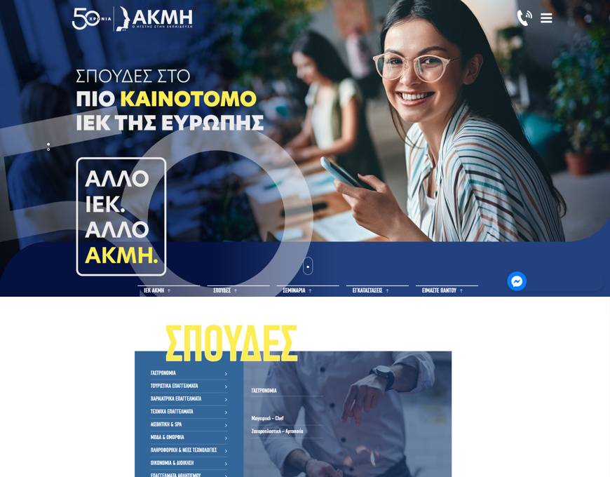
There’s not a lot that need to be said for the AKMI IEK! It is one of the largest and best private schools of the country, with excellent studies quality, competent professors, cooperation with international organizations and thousands of graduates with real prospects in the labor market.
The challenge we faced since the very beginning of our acquaintance with the AKMI IEK partners was immense!

Need

Ensuring success for AKMI IEK was the absolute goal. We have studied, compared and discerned all critical factors, in order to exceed our expectations and the sector competition and create a unique site with bold aesthetics and innovative features.
The website functionality and user experience were the basic pillars in creating this website, exclusively custom-made, without any ready-made visuals. Thousands of code lines certify this impressive result in website with trailblazing features and special effects.
Our basic goals were:
• Easy user-experience
• Bold visuals
• Responsive design
• Impressive effects
• Functional navigation

Solution

We created and exclusively custom site, with high loading speed and harmonious management of large information load, without any hiccups. We utilized various operations and acted smartly where needed to save space and facilitate users in finding what they need, providing interactive features!
We could spend lots of pages to analyze how iek-akmi.edu.gr is a model site for Greek standards

However, we chose to state some of its attractive particularities that make it so unique:
• Menu
• Hero Banner
• Sections & Design
• Responsive Design
• Immediacy

Benefits

Menu
The site menu is drawer-type, so that it does not occupy a chaotic large part of the screen, but employs special effects to provide easy and comfortable navigation to each custom section.
Hero Banner
Regardless of the device used by the visitor, the hero banner occupies the entire screen and fully adjusts to its dimensions. In a very discreet way, it contains basic links as a branch of the basic menu. This helps improve user experience.
Sections & Design
Each section is specially structured with the use of titles and each image has its own character and colors.
In each category, the huge load of information has been smartly allocated so that it does not tire visitors and provides easy and pleasant navigation.
Responsive Design
Either from a mobile device or a desktop, users can navigate quickly and easily on the site, with excellent adaptation of all elements included, to the very last detail.
Directness
Potential students and simple users can find the school of their liking in just 2-3 clicks, with all the information they need. They can also express interest, using smartly located contact forms and links throughout the site.

Do you want your business to take the next step into the new digital era?

Do you want your business to take the next step into the new digital era?

Relative Products

Web Design

A specialized team of partners applying the practices used today.

Web Development

A specialized team of partners, creating usable, functional and innovative platforms.
This site is registered on Toolset.com as a development site.